Why advertising? I have asked myself this question many times. I was reading a book by Chip Kidder about a graphic designer in an ad agency, and I remember a dialogue between two characters that centered around how advertisements are never interrupted - the world is interrupted for them. I thought this was a very interesting point and it has not left my mind since reading that.
It's important to note that for advertising to be effective it has to be relevant to you while simultaneously being presented through the correct medium. It is definitely effective within the world of advertising to recognize this, and I connected with the public service ads about stopping people from texting and driving. It was also interesting to note the advertising (product placement, billboards, etc.) used in video games - targeted at that particular audience. Advertising can be seen and effective anywhere and everywhere - you just need an effective team to be able to do this.
There is so much work that goes into advertising, especially regarding the research of products, audiences, challenges, and solutions. I feel that the creative brief is the perfect way to break down what an advertisement should include, while addressing the important parts of the particular thing being advertised. There is also a continued interaction between the client and the agency, which is important to make sure that the direction is contingent.
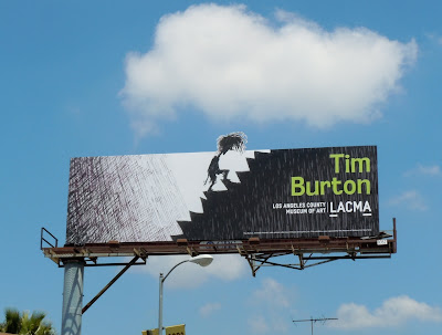
In chapter 2 there was a Case Study on an exhibit of Tim Burton's artwork by the Museum of Modern Art. For my image I chose to use this billboard example of another exhibition of his work at LACMA. As a billboard advertisement, there is a lot that one has to take into account, namely, how to get the point across as fast as possible. The overall style of this ad definitely speaks to the audience that would be "Tim Burton" as well as the characteristic of the character's head peaking out from above the sign is an effective way to make it seem "out of this world" - once again going off of Tim Burton's style.

No comments:
Post a Comment